Flowbite Svelte: v0.46.14
Svelte: v5.0.0-next.179
SvelteKit: v2.5.18
Vite: v5.3.3
Gallery
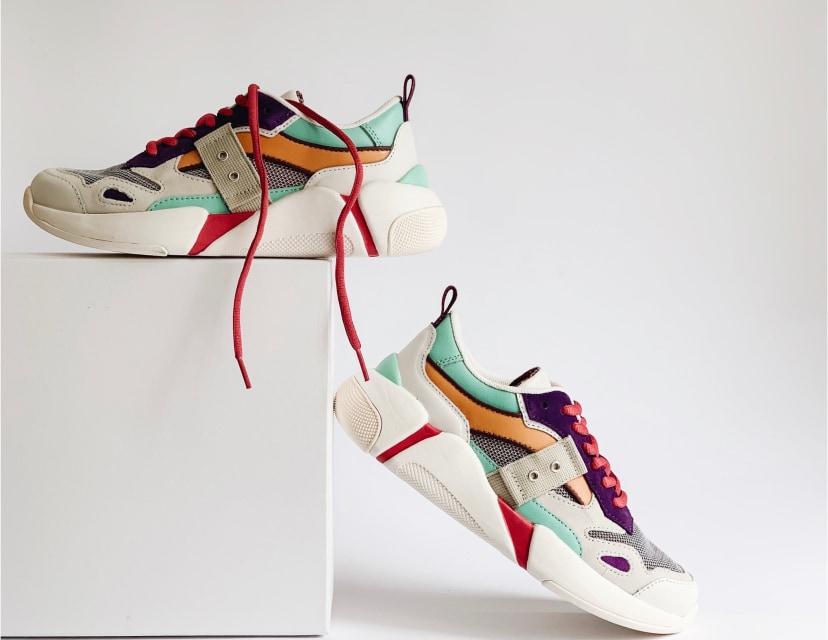
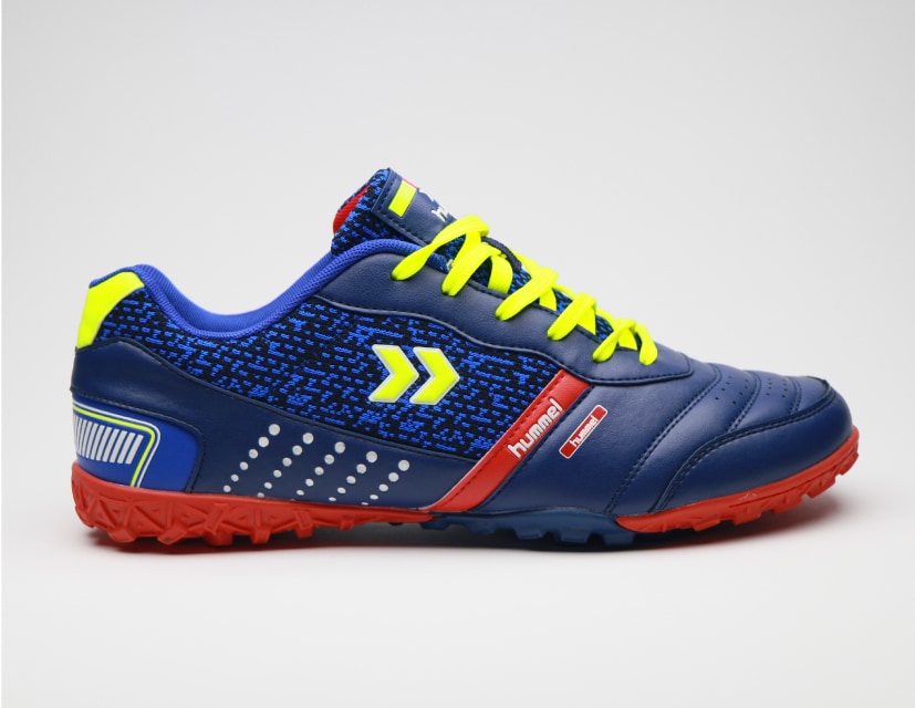
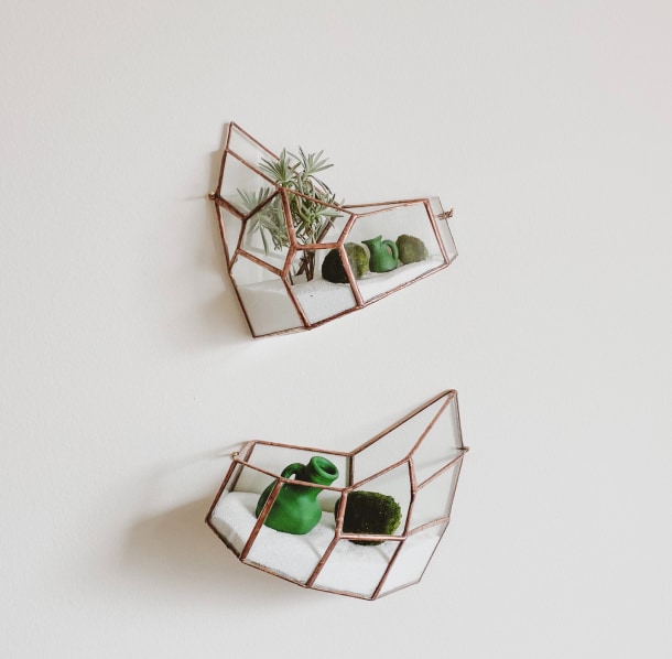
The gallery component can be used to show multiple images inside a masonry grid layout styles with the utility-first classes from Tailwind CSS to show a collection of pictures to your users based on various layouts, styles, sizes, and colors. This component is recommended for usage within marketing UI interfaces and website sections when you want to show pictures of your team members, office pictures, or even case study images.Default gallery
Use this component to show a collection of images inside a gallery. Number of rows in the gallery is set by passing the `grid-cols-n` Tailwind class (including the reactive prefix). Spacing between images is set by `gap-n` class. If you don't set them it behaves like `grid-cols-1` and `gap:inherit`. Example below show a gallery with three pictures on a row.


Masonry grid
This example can be used to show the images inside a masongry grid layouts with four columns.


Featured image
This example can be used to feature the most important image and show a row of five pictures below.
Quad gallery
Use this example to show four larger images with two items on a row.Gallery with tag filters
Use this example to show a list of tags and filter the images below based on the activately selected tag.Heterogeneous gallery
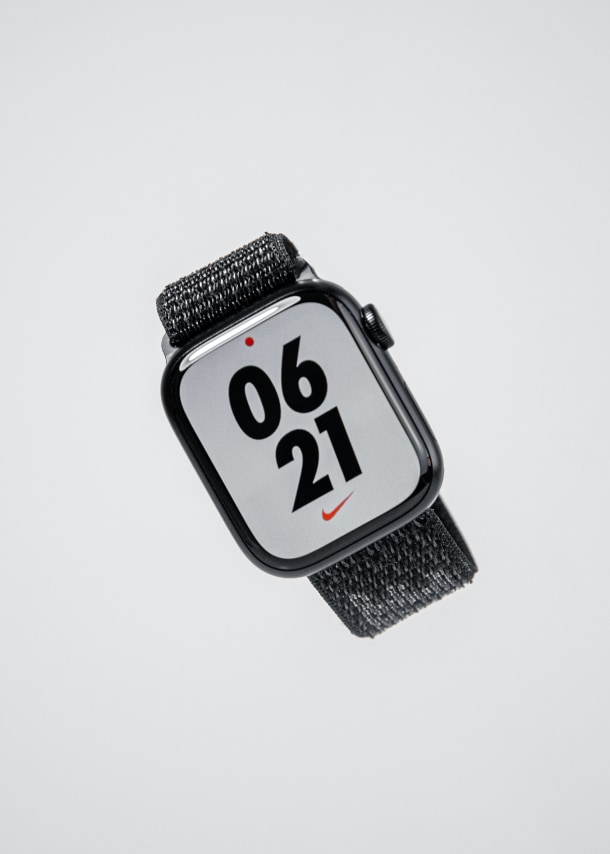
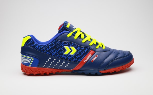
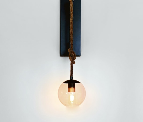
Gallery items don't have to be all the same but then you need to list them manually - don't set the `items` property. Sale
Sale
Custom image rendering
This example shows how to get a complete control over the gallery images look and feel.